how the lamp appears when it is turned off.

FISPAN

A three-month corporate website and brand overhaul. Working in collaboration with both UX and Marketing, I lead this project to reinvent the brand’s visual identity and website to deliver a strong, unified brand experience that communicates clearly, but isn’t afraid of being playful.

software: Sketch + Illustrator

summary

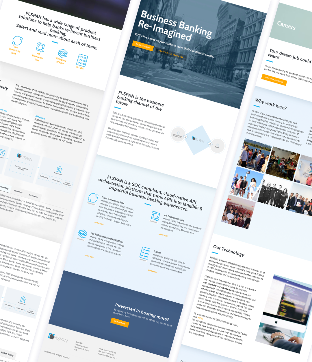
FISPAN’s corporate website serves as the hub for investors, current and future clients, and even employees. Users visit the website to learn more about the company, decide if they want to purchase the product and to book demo sessions. One of the biggest challenges with the previous iteration of the company website is that it was very complicated and vague; it was hard to understand what the company does or even what the product is.

As an additional task, the company was undergoing in depth rebranding, starting with a new company message and ethos. Thus, I was tasked with creating a new website to prioritize effective communication and brand cohesion with the new visual identity that we were in the process of creating.

before

a detail image showing how the lamp can be rotated to form new shapes

after

a detail image showing how the lamp can be rotated to form new shapes

iteration

one of the original forms that we were considering

To Kick things off, I performed a content, and usability audit of the existing website as well as the newly proposed content to determine areas for improvement. In addition, I tackled the information hierarchy issues next to establish the foundation of the site. I did this with a card sort exercise conducted with the marketing lead to sort and group topics and subtopics.

Takeaways:

1. The copy is long with a heavy use of jargon

2. There is no strong identity or credibility

3. Stock imagery does not add to the story
one of the original forms that we were considering

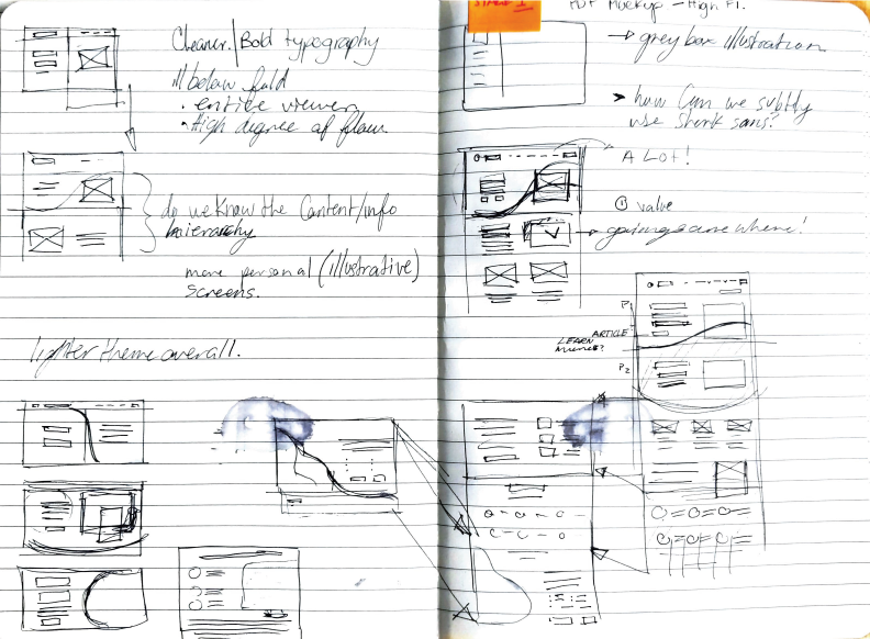
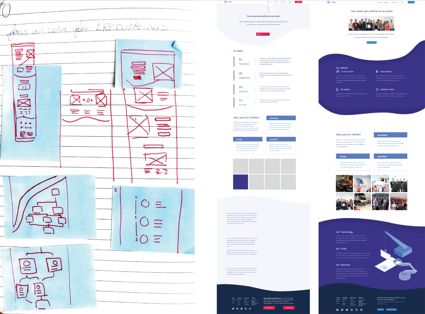
We identified key pages to begin work on and I began sketching wireframes out in order to plan where the copy and content should go. When planning out the art direction with the head of UX I was encouraged to introduce a visual heavy layout that leverages FISPANs existing illustration style.

This part of the process was very iterative as I was creating the visual ID, mockups and wireframes at the same time. Additionally, as mockups were approved they were sent to an off-site developer with a spec version for development, so there was a very fluid back-and-forth workflow.
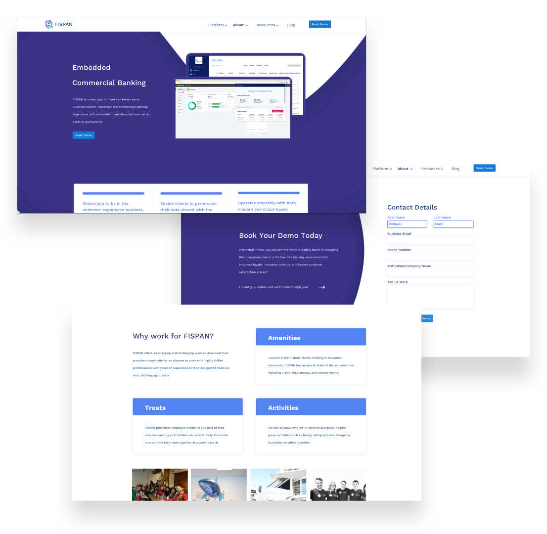
final form

a detail image showing how the lamp can be rotated to form new shapes

  • Simple and clear: FISPAN's new website puts simplicity and clarity at the heart of every page. The refined hierarchy and copywriting efforts lets content shine so that viewers have easy access to the information they seek every step of the way.
  • Storytelling with imagery: The biggest issue with the current website is poor communication across text and imagery. With the new visual language defined, imagery can support the content so that users can browse and consume more readily.
  • Unified Brand: Throughout the process of developing the new website, I was also responsible for refreshing all aspects of the brands image. Across all changes, the website and brand assets were continually designed to exist harmoniously.

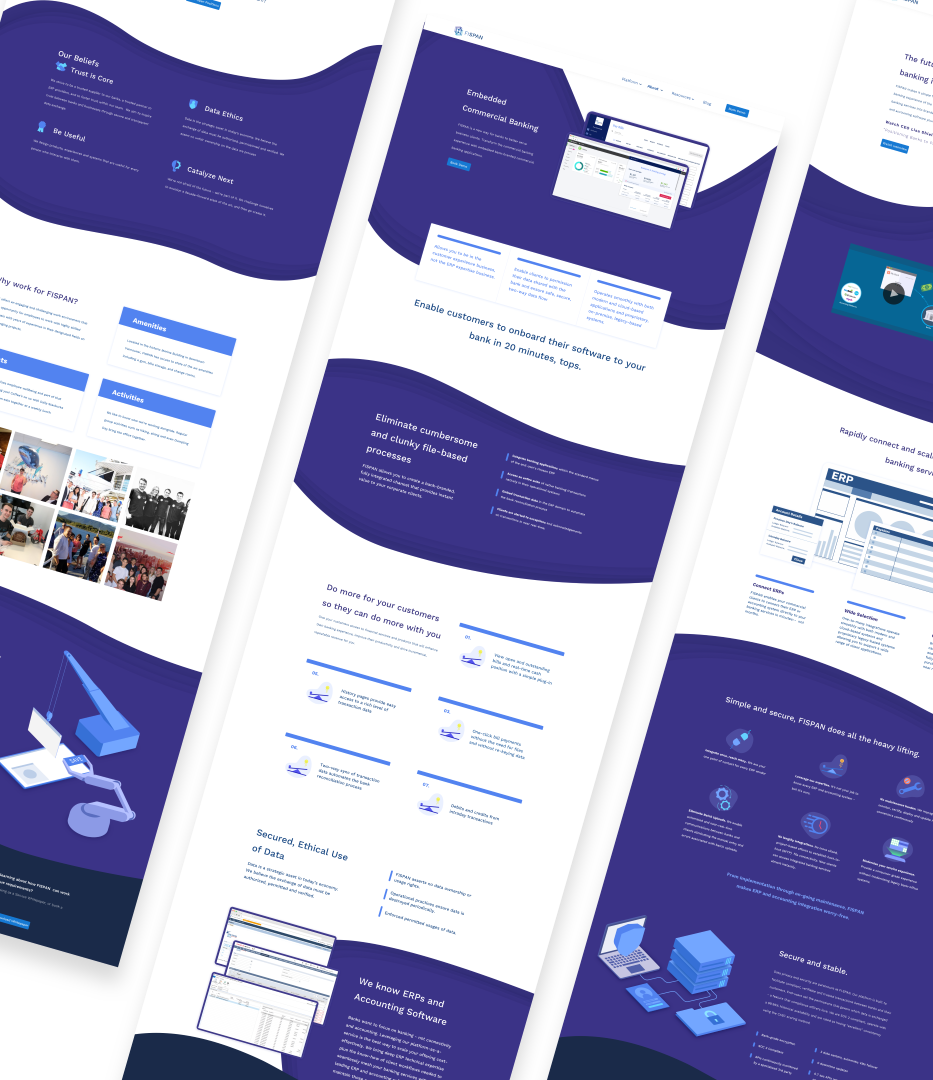
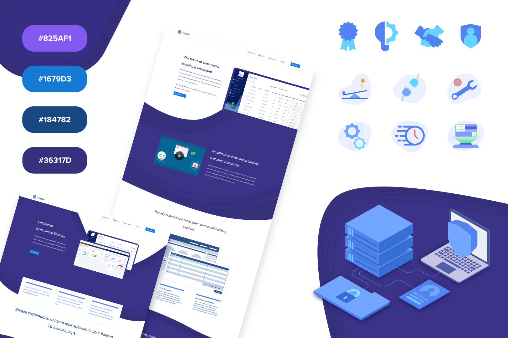
The finished product brings together playfulness and professionalism to present a strong and distinct brand image. The indigo and blue theme paired with the simple, isometric images sets the brand apart from other companies in the field. Additionally, it communicates an image of whimsical strength which helps engage and draw users in.

More significantly the custom imagery and refined copywriting provides a more clear path for communication. The enhanced communication techniques are further supported by a clean and simple hierarchy that is easy and intuitive to navigate for casual users.

conclusion

This project had ups and downs, but I learned so much in completing this project because I owned the work from start to finish. This was one of the first times that I have been involved in every stage of the process and I learned a lot about why each stage is important. For example, checking in with the developers after the specs have been sent was a new part of the process for me. I now see how critical this relationship is, as I was able to provide insight and work with the developer directly.

The newly renovated site was announced mid october and launched shortly thereafter. Throughout the process, I often had to shift strategies and plans changed often as stakeholder values shifted over time. Although this led to a slight delay as I often had to scrap work, or start over in some way, the finished product ended up being very refined and well suited to stakeholders. Thus, the final live version was a hit with both stakeholders and the company in general.