The initial concept of the app was a low fidelity set of basic grey box screens. This iteration was intended to work out the core functions and communicate a general concept. At this point the primary function is a scanning flow where users input basic data about the lighting and the plant that they want to purchase before taking a “light reading” that uses the phones light sensor to detect the lumens in that spot. On the confirmation screen the app reflects whether the amount of light detected is adequate for that plant’s health. This screen also allows users to save this data as a “plant profile” so that they can more easily manage their plants and rescan if they desire.
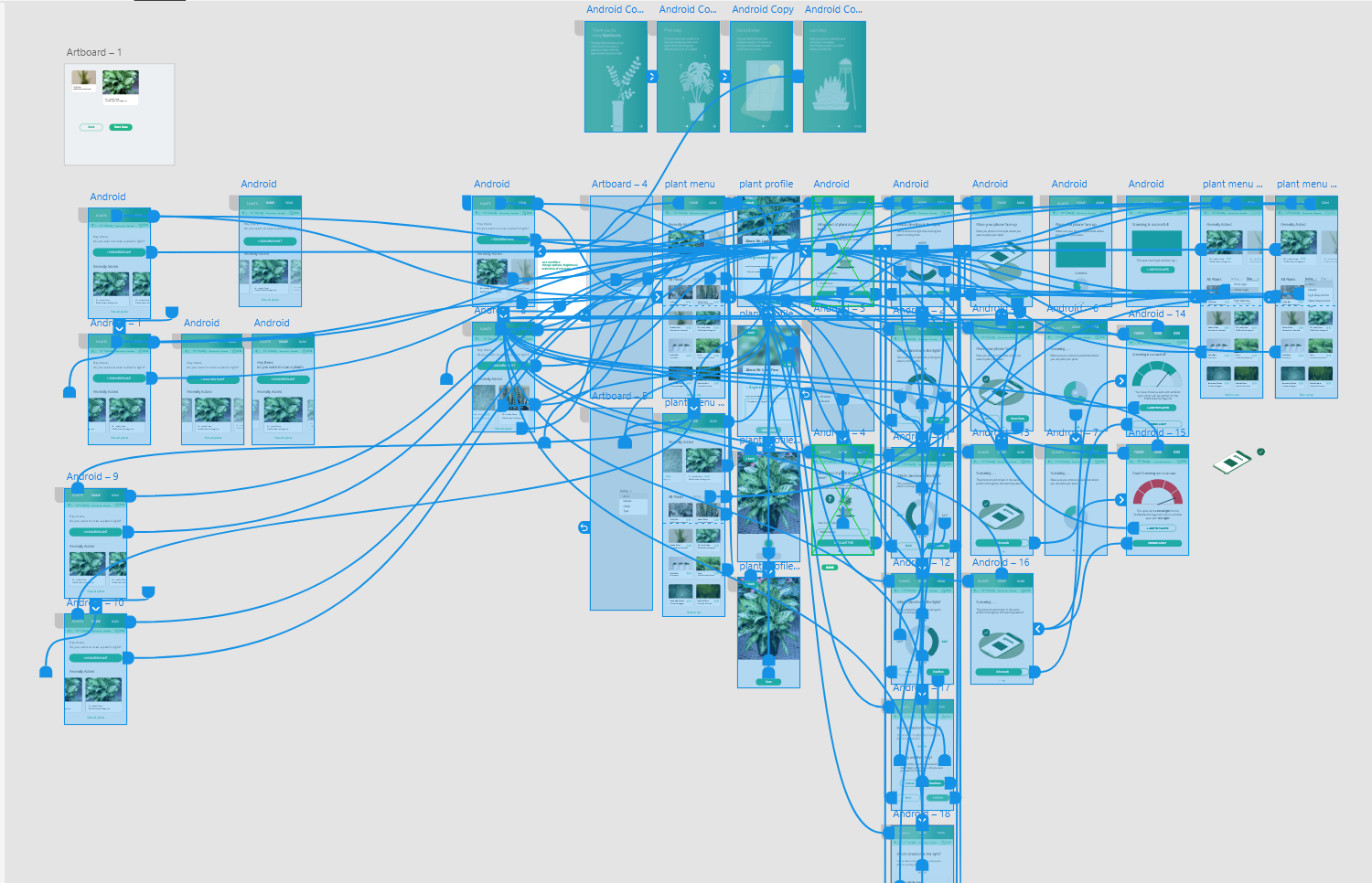
The next iteration was highly focused on the interaction flows. Having chosen to pursue this topic we spent some time with a white board to flesh out the details of the interaction flows for the two main functions. We also explored different UI patterns that we could leverage to make the concept more usable.
full prototype in adobe XD
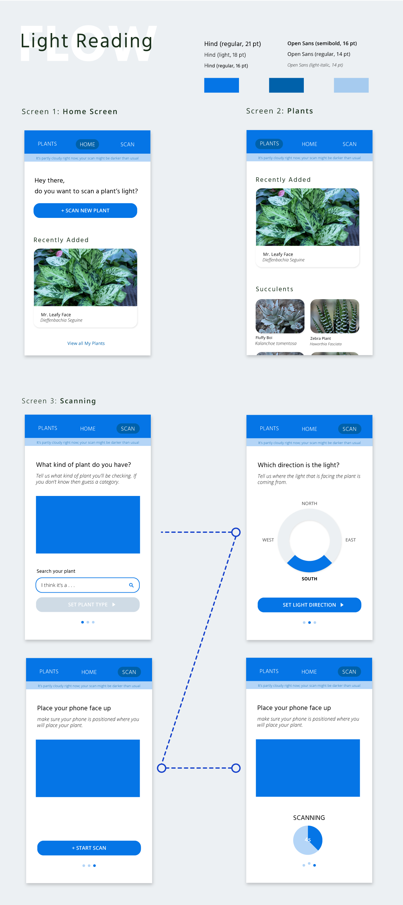
For the next phase, we wanted to start user testing to make sure that the different aspects of the app were usable, and the goals were clear to different types of users. For this iteration we went high fidelity to make the testing as smooth as possible. Our results revealed that we had some heuristic issues with providing enough user freedom. Additionally, we found that our users wanted more information on screen at a time and a more directed experience for the scanning process as some details weren’t clear why they were important.
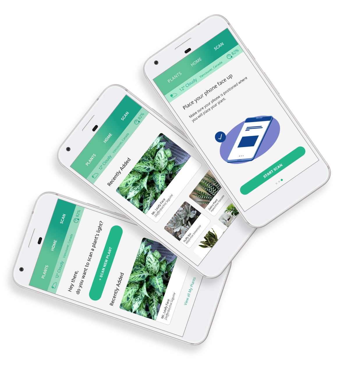
In the final version of our app we primarily updated the UI to display more information at a higher level. We also made the scanning process more clear with a step by step experience that leverages imagery and micro animations to explain each step that needs to be completed by the user.