how the lamp appears when it is turned off.

NOKIA

This four-week project is a major UX overhaul of Nokia Software’s help and documentation center. Our team’s UX researcher, tasked me with redesigning the search experience to bring a more contemporary experience that leverages the common search practices of today without becoming radically different and confusing our long-time users.

software: Sketch + InVision

summary

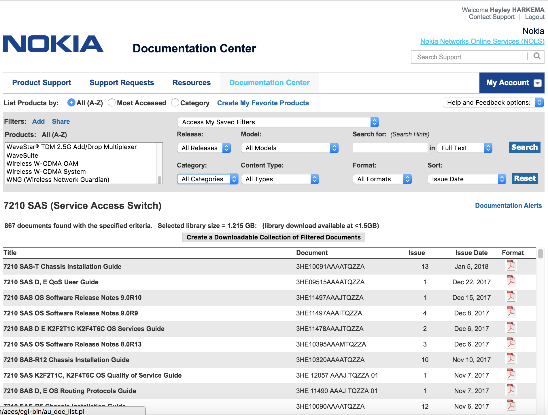
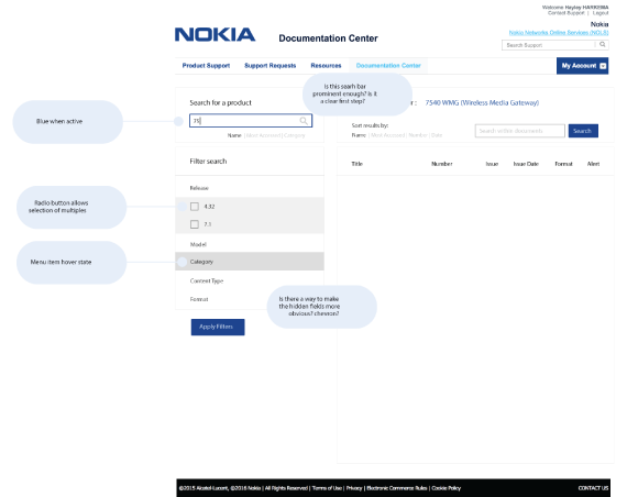
Nokia’s documentation center is used to reference any Nokia software related document. When users’ need help, they reference release notes, guides, and technical documentation from this portal. Documents are accessed by selecting the product from a scrolling menu and filtering the results until they can find the document that they need.

This method of searching was slow, provided too many results (often thousands of documents), and relied on the users having a high level of knowledge about their topic. When we began to redesign the doc center we found at least five other versions of it that users had made; the experience was that painful that users were making their own.

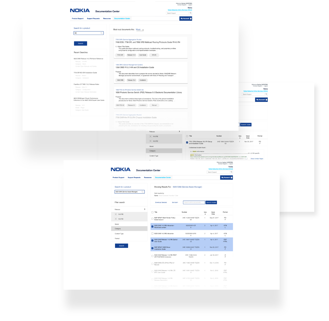
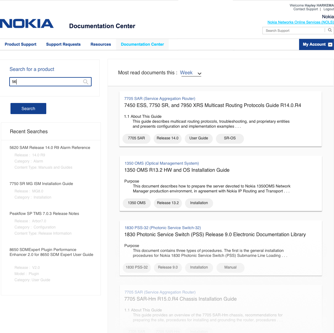
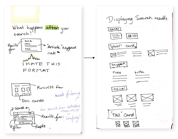
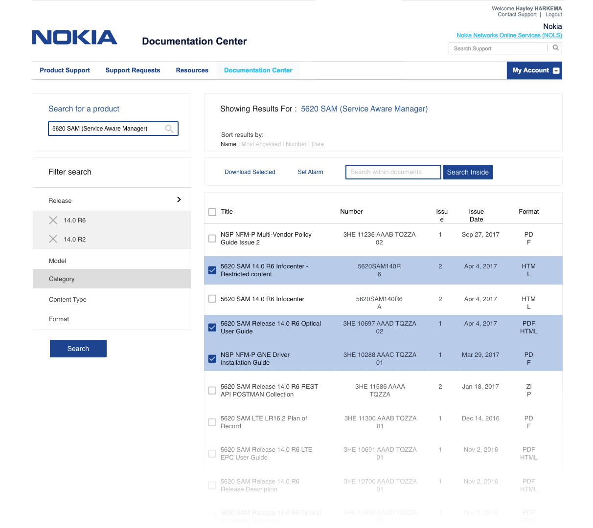
My redesign turned the doc center into a search driven experience that employs facets to filter through the results. Additionally, we leveraged personalization to make the experience more relevant and speed up future searches for our users. Often the problems facing our customers and teams are not so clearly defined, so we help nudge them in the right direction as they search.

before

a detail image showing how the lamp can be rotated to form new shapes

after

a detail image showing how the lamp can be rotated to form new shapes

iteration

one of the original forms that we were considering

Before really diving into this project I spent some time researching and understanding the “old” center and the types of documents within it. This was one of my first projects at Nokia, so I was very new to a lot of the topics covered in this project. Furthermore, I had never used this product and thus I wanted to learn how it worked and why it was used before I tried to redesign the system.

Takeaways:

1. The system is immense

2. The users are highly technical

3. The users don’t know what they’re looking for.

one of the original forms that we were considering

With this insight I introduced a soft redesign that really only changed the flow of the original experience. While an improvement, this version did not go far enough. To get at the heart of the problem, I had to completely start anew.

The second iteration began with a list. I listed every function and purpose of the documentation center and analyzed its value. By this point the developers had weighed in and expressed their wish to keep all present functionality. However, it was clear that not all of the functions were useful, and their value needed to be reassessed. After talking to the UX researcher I presented the second iteration.

final form

a detail image showing how the lamp can be rotated to form new shapes

  • Natural language search: The new doc center is powered by a natural language search that allows the users to search more intuitively. This was particularly important as we had learned that our users often did not know what exactly they were looking for. By using a natural language search the user has more freedom as they can be less precise in their phrasing and the auto suggestions nudge the user in the right direction.
  • Split the screen: The decision to split the screen between results and search functions (search bar and filters) is key to this design. One of the problems with the doc center is that the search functions and the results are equally important and codependent. The user needs to be able to adjust their search as they view the results.
  • Sorting at the beginning: One issue with the old doc center is that all functionality is represented equally. Here we made sure that the sort function was presented early and obviously. Additionally, we made sure to visually link it with the results.

The final iteration kept all the new changes that had been introduced. We now added personalization as there had still been worry about searchers not really knowing what they were looking for. Personalization was used to address this issue. The center now records the user’s recent searches so that they can quickly return to documents that they have been using lately without having to search around for it again. Additionally, trending and suggestions of content were added in order to welcome the unsure user.

conclusion

As of today, the new documentation center has been released in its first stage and the final iteration that you have previously seen will be implemented in late October. In terms of usability and aesthetics the center has been improved immensely. We have not been able to conduct significant testing on the experience, however the developers who have made the first release have reported that their own experience with the new center is much smoother.

Throughout this project I learned how valuable iteration and review really are. With each version of the doc center the experience was refined and developed further into a smooth, intuitive experience. I also learned to appreciate the importance of having fresh eyes review the project to provide new insight.