how the lamp appears when it is turned off.

UAR Online

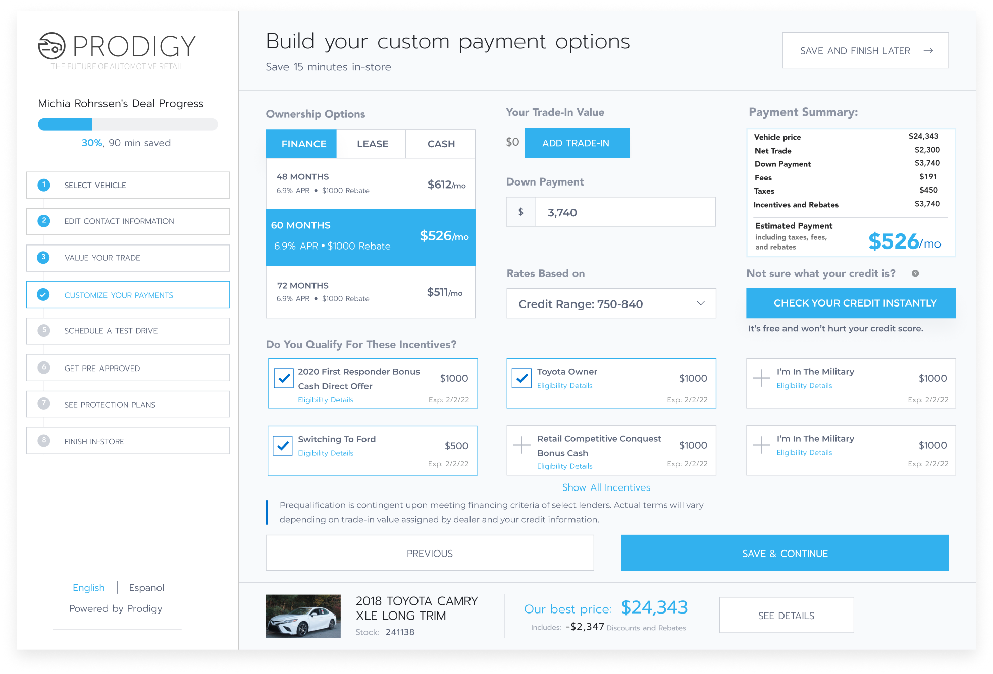
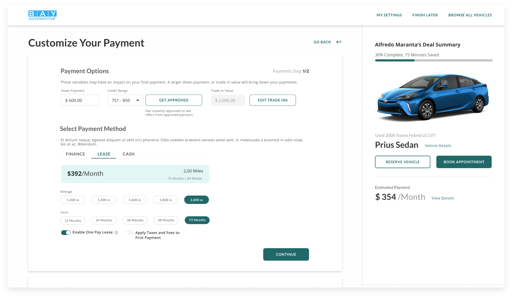
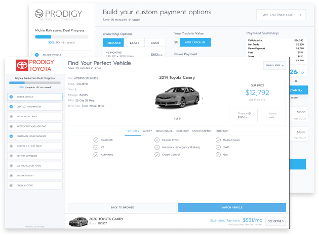
This six month long project is a major multi-platform redesign of Upstart Auto Retail’s (UAR) online tool.

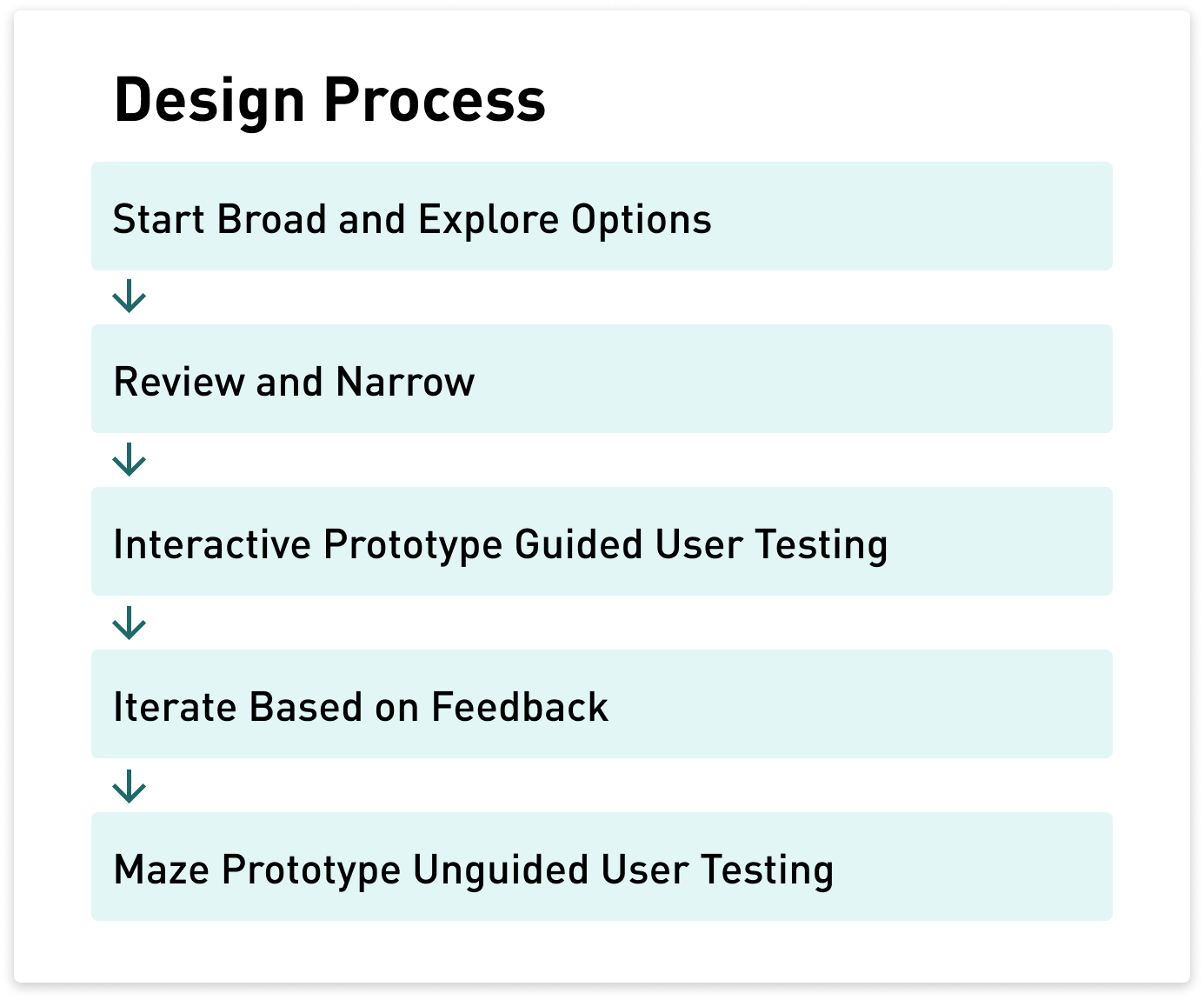
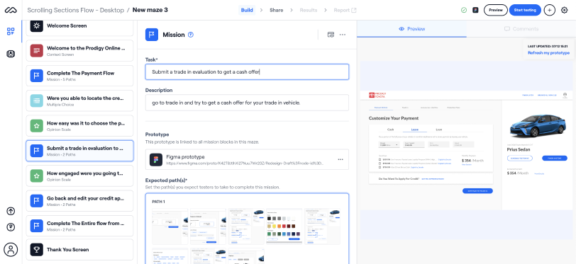
Driven by the completion of a major research project assessing the success of our online platform, I was asked to take this customer facing tool that enables users to configure their vehicle purchase details and transform it into something friendlier, easier to digest and more guided.

My Roles: Lead Product Designer, UX researcher, Art Director, Design System Manager

VIEW DEMO

Summary

Upstart Auto Retail (UAR) is a SAAS product that pairs with traditional dealerships to provide a more efficient, and transparent vehicle purchase process both online and in physical dealerships. The online tool enables online car buyers to search for vehicles of interest and, when they’re ready, configure their purchase detail and signal intent to purchase from dealerships.

Key Details

  • Car sales is a trillion dollar industry in the USA
  • 56% of new buyers access dealer sites to learn more
  • Our product integrates into dealer sites
  • Users cannot buy cars fully online using our tool

Before

a detail image showing how the lamp can be rotated to form new shapes

After

a detail image showing how the lamp can be rotated to form new shapes

Exploring The Problem

one of the original forms that we were considering

When I joined Upstart, called prodigy at the time, there was no other designer and the online product had several issues that were well documented from research that had been done shortly before I arrived. After going over the results of this research and performing my own heuristic evaluation, a few problematic themes became very obvious.

Key Themes

  • Complicated
  • Overwhelming
  • Overly Technical
one of the original forms that we were considering

Competitive Analysis

With the results of the research in mind I began by performing a competitive analysis of all of our direct competitors as well as several well known digital retail platforms to explore concepts outside of the automotive space. After presenting this competitive study to our stakeholders we narrowed the success criteria to the following

Success Criteria

  • Supports and guides the user
  • Clearly explained
  • A pleasure to use

Basic Flow And IA Iteration

one of the original forms that we were considering

Equipped with success criteria and a strong understanding of the business space I then began to explore very high level information architecture and navigation. Improving the IA and flow first was essential to correcting the foundational issues that we were struggling with.

Starting with very broad wireframes and sketches, I worked with the project stakeholders to narrow from five initial proposals to two strong options that we then tested with internal and external users to validate before continuing to iterate.

Note: we also took a mobile first approach as 56% of users researching vehicles use mobiles devices. So increasing mobile usability was paramount.

Testing Versions

We tested twice during iteration. Once using figma prototypes to evaluate two different flow and IA options, and the second using MAZE prototypes to validate the design that evolved from the results of our initial testing.

one of the original forms that we were considering

Unexpected Test Results

In our guided sessions we had anticipated one flow would perform better than the other as it reduced the amount of clicks by over 3X. My PM and I were both shocked to find that roughly 83% of our users preferred the slower flow.

one of the original forms that we were considering

Art Direction

While Continuing to iterate on the flow, I began to narrow in on our visual design direction by hosting two workshops with our stakeholders: One to set overall direction, and the second to focus on details.

one of the original forms that we were considering

Design System

Ultimately I was able to create a visual identity that encompassed the high level look and feel and got into more specific details at the component level which eventually became our design system that is still maintained and used by designers and developers in Figma.

one of the original forms that we were considering

Ongoing Iteration

one of the original forms that we were considering

At this point, we were roughly 2 months into design iteration and needed to lock in a fairly close final iteration for a large conference. I went into rapid iteration, working through the existing pages and features in 2 day sprint cycles.

The rapid iteration allowed us to close the gap on overall design principals in two weeks to begin iteration on each feature and page.

Each page and feature was approached with an evaluation of effectiveness and value before I began design iteration. Once the evaluation was complete, I continued the rapid iteration sprint cycles until handoff.

Hand off documentation was developed in the form of figma files and well-documented PDFs.

NADA and Acquisition

With most of the application in some form of iteration in our new design language, we felt comfortable running a very high fidelity demo of it at NADA 2021.

I learned to use Protopie and created an end to end advanced demo with dynamic inputs from February to the end of April. The demo was used at NADA 2021 in March 2021 successfully to secure over 700 sales.

Unknown to me at the time, it was also the first asset shown to Upstart's founders to secure our Acquisition.

Final Form

Basic Summary

In the end I worked across five drafts with 33 sections that each had a PDF spec produced with close to 600 screens designed in all including mobile and a base desktop form. Each spec accounted for multiple use cases and edge cases and included detailed interaction information.

In addition, I made a complex protopie prototype that was demoed at NADA in March of 2021 and used to secure the acquisition of Prodigy with Upstart.

This project took around six months from research to handoff, so there is more to the story. If you're interested to know more please feel free to ask me any time!

Major Design Decisions

  • Splitting Browse and Purchase: Our old design combined vehicle search and selection with the rest of the purchase flow. This caused two issues: it added to overall clutter on the screen which caused a more overwhelming experience, and it led to confusion when customers would switch cars part-way through and have to restart. In addition, we identified two primary mental models for users: browsing and learning, and ready to purchase. Splitting the experiences added a lot more clarity, reduced the impact of the interface, and allowed for more personalized experiences for each mental model.
  • Intentional Friction: We knew we wanted to provide a slower, more guided experience. Buying a car is one of the biggest purchases people will ever make, so it can be a stressful experience. Even still, we were surprised that adding friction would lead to better conversions, and it was a very controversial direction for us to pursue. After testing to confirm effectiveness, we won the skeptics over and our 72% increase in conversion on credit apps is largely attributed to this intentional friction.

Conclusion

The online redesign entered it’s pilot phase in January of this year. The pilot was a brief two months to verify performance before rolling out to additional dealerships.

We are still in the gradual roll out stage with a sunset date for the older platform set. With regular research and iterations ongoing every quarter.

This project really stretched my skills as a new designer with only two prior experiences taking products from zero to one. I learned so much about working with large teams, iterating and testing over a long period of time, and even got to navigate an acquisition for the first time mid-way through.

There’s still so much potential for improvement, but overall, the redesign was successful, we saw a 72% increase in credit application (our north star metric) conversion and our mobile usage climbed from 38% to 43%.